It was an enthralling experience when I wandered leisurely in the heart of Dubai i.e., Megamall. The extraordinary ambiance, organized sales team, orderly placed products, and terrific accessibility of each product made my experience worth-stashing in the form memories. But I always wonder if I could grab the exact satisfaction while going for an online purchase. What would it take from a digital store to proffer the same experience?
Well, the answer settles on UX design. Right from the introduction of world wide web, UX design is known to be a connecting point between humans and systems. Companies are investing great brains to offer the best human-computer interaction. E-commerce world has reached that point of a competition where UX design and site’s ambiance carry the responsibilities of drawing customers, alluring through simple & optimized product search, and possibly leading to conversions. A poorly designed UX would tax a lot of time in searching the right products, which could plausibly damage your brand value.
How can you work on UX design to make product page simplified and finding a facile job for your customers?
Big, Clear, and Beautiful Images: Building Blocks Of An Ecommerce
Visuals always appeal brains faster than texts. Visual interpretation helps in quicker decision making than textual interpretations. Products with relevant images as their backing get better views than those items with zero visual backing. Images are known to transfer the interminable details of the products, making your user extract the exact product which they have been searching for.
Here is my pearl of wisdom for setting an image:
- Make sure that images are large enough for interpretability.
- Try to add images with high resolutions.
- Add zoomable extensions to your images. We all like to touch and feel the products. Zoomable images make the complete experience much intuitive.
- Focus on all the colors/variations of the products and upload each one of them. A product available in multi-colors would let customers settle for the right choice.
- Ensure that you minimize the blank spaces on your product page. Set the ratio of image size with that of page size such that page looks instinctive.
- Whatever images you use. Be it a manufacturer’s image or your own modeling shoot, be sure that all the images are consistent across the board.
- Keep your background plain and simple. This doesn’t let the image’s design to coincide with the background, diluting the chances of visual complexity.
Give 360-Panoramic View: Incorporate Alternate Views
You want to create an experience where users barge into the store, pick the item, and observe it from all the angles. Don’t you? Appending such an atmosphere to your store would confirm the correct product for your customers. You can do this by adding alternative images of the products. Stuff your store with images clicked from all the angles.
I sound like history when I ask you to attach images from all the angles because eCommerce is slowly making its tentacles reach towards 3D and wearable technologies. But for now, incorporating alternate views is an efficient way to spawn an immersive experience.
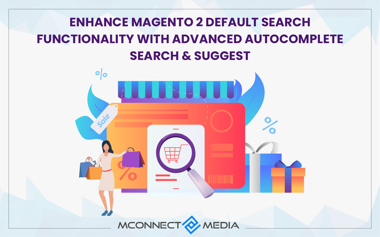
Autocomplete Search Bar: An Intelligent Torch
One way by which you can produce UX satisfaction is by introducing a smart search bar. There is no better UX practice than to make your search engine like Google.
Recommended Read: How to Make Product Search Easy for your Shoppers?
In order to make your search engine smart, you need to check some requisites:
- Let it autocomplete the search and offer a list of drop-down options from which a user can select the desired menu.
- Make your search engine map the synonymous words. Not all users would type the exact string as you want. Synonym tool can be wisely used to search the words which mean alike.
Call To Action Buttons: Keep Them Within the Radius of Vision
You can compel users to take an immediate action on their selection. There is a need to generate an urge to take actions. You can drive the users to take necessary steps by adding recognizable buttons. Buttons can decide whether it is going to be a conversion or a bounce.
Since we are talking about the product page, here is the series of impelling buttons mandatory for gleaming up a user-experience:
- Add to cart button: Users with a tentative set of mind frames could easily add the products to the cart. What does it mean? A user won’t have to necessarily buy it but wait for the best deal. Adding to cart is similar to adding a bookmark to your favorite book. Adding fancy texts and graphics, affixed with certain deals near the button would let them click the next button called “Buy now”.
- Buy now button: Buy now should be able to compel the user to take action. Having unrivaled schemes would definitely add a compulsive depth for purchase.
Don’t Over-do The Unconventional: Could Boomerang Terribly
While it is good to have an unconventional vision, customers really don’t have much time to navigate revolutionary designs. As soon as customers become accustomed to all the navigational tools on a website, major changes in the product finding methods could make them vex at your store. Despite the fact that you put all your “visionary elements” on the website for customer’s ease, they wouldn’t care for your efforts.
Check this brief sequence which describes what your UX design should look like to better the product navigation:
Adding common designs and conventional navigational extension would make your store uncomplicated.
For example: Adding traditional filters like Filtered navigation could result in effective product searching by letting the customers break-down their product selection by discarding results which are of no relevance.
Adding oversimplified Product Part Finder extension in your online store for industries like automobiles and electronics instead of intricate ones.
For example: Working on UX by adding simple drop-down components based on primary criteria/attributes like model number, model date, etc.
Show Related Products: Narrow the Doubts
How good would it be when you are able to compare the prices of the products from the product page? That’s what makes a related product extension a dynamic code block. Related products not only aggrandize the stature of your online store but also strengthen the user-experience.
How is it an Important Aspect of Product Filtering?
- It narrows down the doubts of customers. Customers could juxtapose multiple products and check for the similar and contrasting properties of them.
- It amplifies UX in such a proficient way that users don’t have to manually put external efforts to find the products.
- Let users navigate to the related products and open their product page.
Use Relevant And Suitable Labels
In generality, eCommerce navigation and product finding should have a product category labels. These labels should be able to classify the range of products.
To make these labels constructive, follow these obligatory:
- These categorical labels should not be complicated.
- Single-word should classify the departments.
- A user should be able to understand what are labels implying at. Only then they will be able to scan the correct products.
Conclusion:
Your eCommerce website should be designed with such sincerity that it should be able to generate a quick interaction between your system and the customer. UX is the key to answering your hunger for more. If you fail to work on UX, you will fail to work on all the fronts. If you want to know more about eCommerce website design or need to build or develop your online website, feel free to talk to Professional eCommerce website designers at M-Connect Media.


