How Can the Checkout Design Help in Better Conversion Rates?
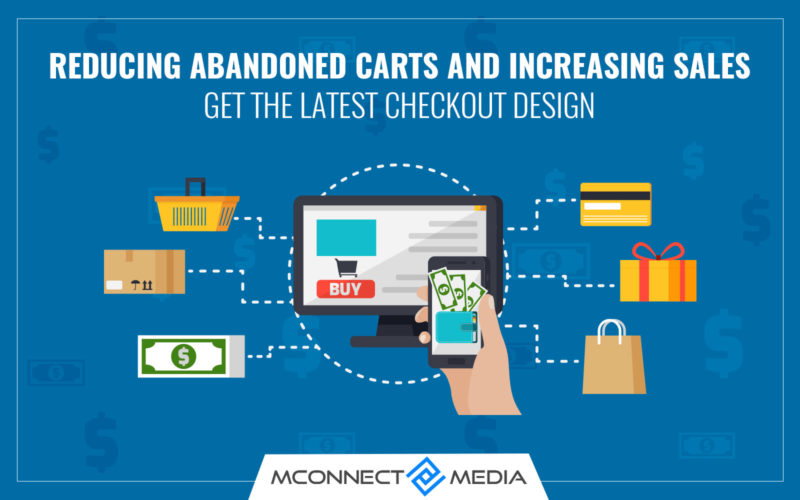
Shopping online has truly been a blessing to hoards of people who do not actually find time to go out to the store. No doubt the number of online shoppers has increased but the number of people abandoning the shopping cart too is significantly on the rise. What is the reason for such abandonment at the fag end of the entire shopping process? Does it hit the sales of the online business? Can the store owner do something to mitigate these abandonment cases and convert them into more sales? Let us take a sneak peek. Our Shopping cart design expert will help you to design latest eCommerce checkout that increases sales and give unique and branded approach for your eCommerce business.
First and foremost it is essential that we understand what the current trends are in the eCommerce checkout design.
Even before that, it is essential to understand why shoppers would abandon their purchase after reaching that stage?
It is the perceived security and usability of the entire checkout process that brings about either abandonment or sale. Smashing Magazine has conducted a study to understand the current scenario in eCommerce checkout designs of top 100 grossing stores in eCommerce. Here are a few of the highlights which will help us understand that a few changes here and there in the checkout design will definitely reduce the shopping cart abandonment rates.
- The checkout process when very lengthy ends up in a case of abandonment. When you offer your customers to log in or shop as a guest, the process would not take so much time and they too would feel that the process is less cumbersome. This way you are providing an option to them to shop without registering with your website. But, if they like your product and service, they are bound to come back for more.
- When they register they are brought to the newsletter mailing list too. When these keep getting into their inbox at periodic intervals, there is a scope that it is viewed as spam or forces them to unsubscribe or opt out.
- Most of the times, the same information is asked twice. As a store owner, you need to ensure or review that the steps in the checkout process are not repetitive. Providing billing and shipping information many times can eventually turn out to be a loss for the online business.
So, all the potential reasons for abandonment at checkout need to be eliminated so that the conversion rates are high.
Checkout experience matters most
Shopping cart abandonment is a bane that is eating up every store owner’s mind. The shopper keeps adding products to his shopping cart but when it actually comes to completing the entire process, he decides to give up on the entire purchase.
In some cases, the checkout process is too long or complicated. Sometimes, people are forced to create accounts with the store and in some cases, the payment options are not adequate or the shipping options are not favorable.
When these issues are addressed by coming up with a simple and fluid checkout process, it will give the shoppers a pleasurable shopping experience. Magento 2 has now become the boon for many online owners as it has focused on all common checkout issues so as to provide a good customer experience.
How does Magento 2 offer a better checkout experience?
- First and foremost, in comparison to Magneto 1, the number of steps has been reduced in Magento 2 and hence is much faster. The process that would take six steps now takes only two steps. Therefore, the entire deal is quickened and gives no scope at all for an abandonment of the cart. The shopper is no longer frustrated as there is no filling of forms. This is definitely a plus point for those who shop from their smartphones. They will no longer have to fill out forms through their small screens.
- When the customers are in the checkout process in a Magento 2 store, there are not many pages that will distract. There are only the logos of the company and payment and shipping tabs. In comparison, Magneto 1 version used to have numerous links which were distracting to the customers.
- Customers had to provide information twice, once for billing and once for shipping in six checkout steps in Magento 1. Magento 2 always related the billing address to payment. When a payment method is identified, a space for billing address would pop up below. The version 2 eliminated some unnecessary steps.
- Magento 2 is more intuitive when compared to Magento 1. And this is definitely one of the reasons to give a better checkout experience to the customers. By being intuitive the store is offering its customers ease to accomplish tasks and finish the process of buying at the store. The customers know what they are doing and are not wee bit confused. The discount codes and gift options placement in Magneto 2 are just two examples of intuitive design.
No doubt there may be umpteen reasons for shoppers to abandon their shopping cart but a few of the reasons could be checked by concentrating on making the checkout process less cumbersome and confusing. That is what Magento 2 did! It has become slicker and less confusing. Order completion takes less time now.
A better shopping experience (at the checkout stage) is definitely helpful for cutting down on the shopping cart abandonment cases and paves the way for more conversions.
If you are facing any shopping cart abandonment and checkout issues with your eCommerce website, hire our eCommerce consultant they will be able to analyses your shopping cart issues and will help in improving the conversion rates.










Thank you for highlighting these important points for cart abandonment and how a design can reduce that.