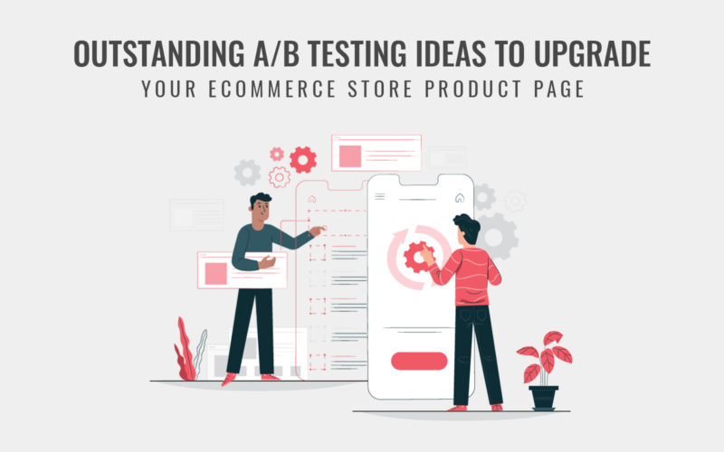
A/B testing means comparing two versions of a webpage with slight or more differences to see which performs better against each other. Implementing A/B testing can improve your conversion rate as well as help you to identify if your marketing strategy works or not. It is simple than you thing and provides very important insights about what customers want. Giants like Amazon and Google often implement A/B testing to foster their business growth.
With A/B tests in place, you can study the habits and behavior of buyers and create a well-performing marketing strategy. You can test any element of a product page and see how it performs. The result might surprise you. Even little changes can perform better and generate more revenue. Checkout button, images and videos, navigation, and other field are just a few elements that can be A/B tested.
A/B testing can prove to be most beneficial for you. With this test, you will find the best version of a page that converts like a charm. And the best thing is that you won’t have to wait long to find out the result of tests. In this guide, we have come up with the best A/B testing ideas for you to upgrade your product page. So, let’s get started then.
- Display Pricing with Different options.
The price of the product is one of the key factors for customers to decide to buy the product or not. Most marketers follow psychological pricing strategy to influence the purchase decisions of their customers. You could implement a pricing strategy that tricks customers to think they are paying less. For example, some people think that $29.99 is less than paying a full $30. Also, some consider paying $500.00 is more expensive than $500.
One more thing you should consider about pricing is to show the discounted amount in different ways. You can show how much discount you are offering in two ways either percentage drop or simply price drop. Analyze the results for about a couple of weeks or more for what works and implement it right away.
- Test with Product Images and Media Files
Product images and media files are the most important part of the buyer’s journey. Your product images should be laid out in the manner that visitor thinks and imagine using it for themselves. You can also add a video of people trying it out. Your media files should not lack the necessary details required by a buyer to visualize what it actually looks like. Detail like color and dimensions get distorted in conventional images. Hence affecting the purchase decision of your customers.
Checkout: Product Attachment Extension for Magento 2 – Upload Downloadable files
To mitigate these issues, you can also try out the by including 360 views of the product, which illustrates the product wonderfully. With 360 views in place, your customers won’t have to go through dozens of other photos. These changes can impact your conversion rate positively. So, you should try it out and see the results.
- Test out Recommendations to Cross-sell Products
When you want to cross-sell products, provide some context for your customers to buy those products. Simply recommending or saying you will like it won’t help them. Do it as Amazon does it. They excellently place other products with a tag “People who bought this also bought” and “People who viewed this also viewed.”
Read more: Manage Related, Cross-sells and Up-Sells Products in Magento
This is one highly efficient tactic to increase the order value of a purchase. Therefore, you should implement and test different ways to recommend a product that goes with the product customers are already looking for. For example, a pair of socks go well with customers looking to buy a shoe. You can also recommend the best-selling product if you are unable to find the product to cross-sell. Try it out for yourself and see what works best for your store.
- A/B test Adding Social Proof
Social proof means the behavior of other shoppers and what do they think about a product can influence the decision of your visitors. And it is very influential when it comes to online shopping. You can also share actions most visitors had made like how many added to the wishlist, how many viewed the item, and how many added to their cart.
These subtle things affect the decisions of most people. Also, most rewarding social proof is reviewed. Adding reviews and testimonials or even FAQs can help you convert more customers. So, try out how these things work for your store and take appropriate actions according to it.
- Test on Removing Unnecessary and Including Necessary Details
When your customers are surfing your store and finding a product through the home page, category page, or search page, it is fine for you to offer featured deals and run banner ads. But when they land on a specific product page, all of these can distract them from making a purchase decision. Test your product page how it converts by removing them and see if it helps or not.
Also, make sure that the product page’s white space is appropriately balanced. You would want to draw your customers in by aesthetically presenting product images and their quality and attention to detail. Your product’s images should have a balanced view so that it is always the center of attraction.
Try including a prominent search box across the whole store so that users can find what they are looking for in a faster and easier way. Remember these few things when optimizing your product page. You never know what subtle change could win and change the fate of your store.
- Test for Specifying Necessary Shipping Details
Try including shipping details like cost and shipping method with an expected delivery date on the product page. Shipping cost is one big reason for visitors abandoning their cart. One study by Baymard found that 50% of US customers leave the checkout process due to unexpected extra charges. So, try to include those costs, if any, to your product page itself. Doing so, won’t surprise your customers at the checkout and will go through purchase.
Also read: Offer Custom or Recalculated Shipping Charge to your Customers
Also, questions like when product delivery will happen, for which most shoppers need an answer. They should find answers to all those questions on the product page itself for their own satisfaction before making a purchase. So, try including these shipping details as well and see the results for what works best.
- Test Color and Position of CTAs
This is one of the most common A/B tests most eCommerce owners probably implement to see which color works best for CTAs. Google, once tested 50 shades of blue color to find the highest converting one for their CTAs. However, many believe that CTAs should only be of red color due to it signifies urgency. But it’s not actually true for every case. You simply have to test to find out what color fits for your eCommerce store.
Also, the appropriate position of CTA at which it is converting better should be only found by A/B testing. By generalizing and placing it above the field might not help in many cases. The optimal placement of a CTA depends upon many factors and complexity of the product. So, A/B testing can help you determine what place is best for more conversion.
Wrapping Up
Optimizing your eCommerce store is not a one-time process. It is a continuous process, that includes research and testing various elements of your website. We hope that these 7 A/B test practices will help you get close to optimize your product pages that convert more visitors and boosts sales. Also, you can consult an eCommerce expert if you still have some doubts about how to optimize your eCommerce store. An expert will help you to get on the path of success with his extensive research and knowledge of the field.


