To increase sales on your e-commerce website, it’s important to think about how easy it is for visitors to use. It’s already hard enough to get customers to the checkout page, so we don’t want to make things more difficult and make them leave without buying anything.
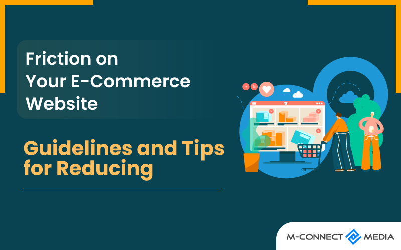
Friction is a problem that can stop customers from making a purchase. It also happens when things slow down or become confusing on a website.
These concerns must be addressed on your e-commerce website in order to decrease shopping cart abandonment, simplify and enhance sales, and produce more sales leads.
So, how can we find and fix these problems? Moreover, Here are some guidelines to simplify things, along with some tips to get started in reducing friction and also making the shopping experience better for everyone.
What is E-Commerce Friction?
In e-commerce, the word “friction” describes anything that makes it difficult or frustrating for customers to do something on a website. It can also happen when they try to buy something, fill out a form, or just navigate around the site. Friction can also be really annoying for customers, and it can even make them give up and leave the website.
Imagine a store spending a lot of money on advertising to get customers to visit their website, only to lose them because of friction. It’s like inviting someone to a party and then making it really hard for them to have fun. That’s not good, right?
In fact, on average, about 70% of customers end up abandoning their shopping carts because of friction. That means they were also ready to buy something, but they gave up because of the problems they encountered.
Even if customers do manage to get through the friction and make a purchase, they might leave the website feeling unhappy and never come back. Moreover, This can also be really bad for a business. Websites with a lot of friction can lose potential customers, make fewer sales, and even damage their reputation in the long run.
What Are The Types of eCommerce Friction?
There are several types of eCommerce friction that can cause problems for customers. Here are a few common types:
Complicated checkout process: When buying something online takes too long or is confusing, it can be frustrating for customers. Also Making the process simpler and easier to understand can help.
Content-related friction: Content-related friction might include ambiguous or misleading online material, distracting links, or a lack of information regarding taxes, shipping, and other expenses. Users may interpret content-related friction as a lack of transparency and become doubtful.
High shipping costs: Customers don’t like surprises when it comes to how much they have to pay for shipping. Being upfront about the costs or also offering affordable shipping options can make customers happier.
Lack of trust: People want to feel safe when shopping online. If a website doesn’t have clear security measures, like padlock symbols or trusted payment options, customers might not feel comfortable buying from it.
Limited payment options: Some people have different ways they like to pay for things online. Offering different payment options, like credit cards or PayPal, can make it easier for customers to buy.
Poor mobile experience: Many people use their phones or tablets to shop online. If a website doesn’t work well on mobile devices, it can be frustrating for customers. Making the website mobile-friendly can help.
These are just a few examples of things that can make it hard to shop online. By fixing these problems, businesses can also make it easier and more enjoyable for customers to buy things.
How Can You Reduce An eCommerce Website’s Friction?
A well-executed and smart website design may lead to a better customer experience, more sales, and more prospects in your sales funnel. To decrease friction on your website, use the website design techniques listed below.
1. Improve Site Performance
E-commerce friction and shopping cart abandonment are frequently caused by slow site performance. If your website is slow, visitors will be unable to browse your items, learn about your business, or make a purchase.
The speed with which a page load has a significant impact on user behavior. Positive first impressions influence how people engage with your site and if they will also spend time reading content. However, Few people will stay on your website if it is slow.
Tips to improve site speed:
- Test your site’s performance on a regular basis so you’re the first to realize when lagging happens.
- Specific slow-loading web pages should be updated.
- Images optimized.
- Remove any stuff that is taking up too much space.
- High-resolution material on product, landing, and sales pages should be compressed.
2. Improve Website Design
The design of your website should be smooth and easy for customers to use. They should be able to explore your site, find what they’re looking for, and complete their purchases without any problems.
If visitors have trouble finding information or navigating your site, you might also notice that more people leave without making a purchase and fewer people actually buy from you.
This is especially important for online stores because you want to give visitors a good experience so they become paying customers who come back again.
Tips for upgrading website design:
- Examine the website if you were a first-time visitor.
- Clean, basic, and minimalist designs prioritize
- No Text squished together
- Use whitespace to make pages easier to read.
- Remove any stuff from the website that serves no function.
- Remove any unnecessary links from your navigation bar.
- Ensure visible call actions
- Remove any photos that detract from the page
3. Provide Several Payment Methods
By offering different ways for customers to pay, you can make more sales in your online store. If you only have a few payment options, you might miss out on sales and lose customers. It’s also important to make it easy for people to buy from you and meet your needs.
Accepting credit cards is really important for online shopping. Moreover, You might already accept Visa and Mastercard, but you should also think about accepting American Express and Discover.
Some other payment options to consider:
- PayPal accepts credit card payments
- Apple Pay and other mobile wallets accepted
- Accepting ACH payments, especially if you sell to businesses.
- Accepting mobile SMS payments
4. Mobile Optimization
As more people use smartphones to shop and make transactions, having a mobile-friendly e-commerce website is critical.
Improving the user experience for mobile users is also critical for growing your business and attracting new consumers.
Tips for optimizing e-commerce site for mobile:
- Make use of a mobile site speed test
- Pop-ups and sidebar navigation avoid
- Maintain visibility of purchasing basket
5. Simplify the Selling Procedure
When customers buy on your website, they have various options for making purchases. The more judgments they have to make, the more probable it is that they will also suffer from decision fatigue.
If customers are overwhelmed, it will also be more difficult for them to complete their purchase, and they may abandon your site without taking action.
Tips for avoiding design fatigue:
- Reduce the number of alternatives on the website
- Pay attention to product descriptions
- Forms that are easy to use prioritize
- Group related product items together
Summary
Making your customers happy and improving their experience on your website is really important if you want to achieve your goals as an e-commerce company.
If your website isn’t well-optimized, it can also be hard for customers to browse, understand, and make purchases.
By reducing any difficulties or problems and making sure your website is enjoyable to use, you can also increase your sales and attract more customers.
It’s all about creating a smooth and pleasant online shopping experience that makes people want to buy from you and come back for more.
ABOUT US
Mconnect Media has a team of experts who are great at creating themes for Magento 2. We know how important it is to have themes that look nice and catch the attention of people who visit your website.
Our experts who know all about Magento can help you with designing, developing, changing, converting, and adding themes and templates. With Mconnect, you can make your website look even better and match what your company wants to achieve. Please contact us for your specific Magento eCommerce design and development project needs.


