Website represents what your business is all about. This means, its your business face. We all know website conversion is directly related to business sales. Having a conversion centric design is the principle of the website design to boost eCommerce conversion. Online retailers should make their website conversion friendly by focusing on UX elements. The merchants should remember the uttermost importance and avoid making website mistakes. Also, they can track their website performance using Google Analytics.
Here I will show how you should design your website.
Your Website Needs Logical Headline
Competitors websites have already secured their places in Google. Now, how you can add value to your website. This is by giving a catchy title that tells your customer what they are going to get in the website content. Why they should read the particular content?
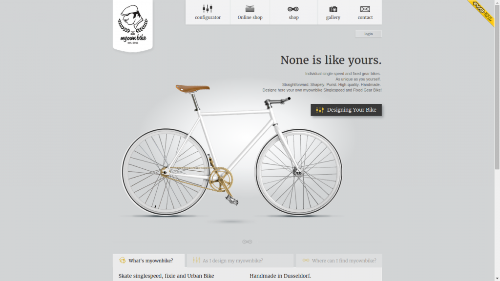
See above image from My Own Bike. A competitive title to grab user’s attention and entice them to take an action.
Few tricks to create a working headline is:
- Use “How to” headline
- “List” headline
- “Get what you want” headline
- “Trends and Prediction” headline
- “Statistic, Facts and Figures” headline
- “Best and Worst” headline
Avoid Overly Designed Website
Website design represents your business. Visitors use this first to approach your website. So, your website should tell them clearly what customer is going to get by landing on a particular page. This is what actually makes sell. If your website is full of uncluttered images, loads of colors, several icons, then it creates confusion and visitor would leave immediately.
What you want here is to have a clear uncluttered design that speaks more than a thousand dollar website.
Skip using any website elements that distracts your customers, force them to click or do not serve the purpose.
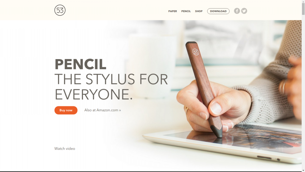
This image from Fifty Three Store shows the usage of minimal colors wisely. By associating the information in an ideal manner, they have highlighted the important information very well.
Speed All Matters
Slow speed can ruin your business sales. An element that boost your website speed is by using the smaller margin that improves reading speed and increased comprehension than without margins. When we talk about comprehension, fixed width layout with set margins are beneficial over liquid layout with no margins.
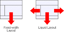
The size of margin and line length both affects the readability and comprehension of your website. Therefore, use both of them ideally.
Your Product Options Should be Limited
Often, several choices of products confuse your customers to buy a certain product. This could be seen by the famous study by Sheena Iyengar which shows several choices of Jam have an impact on their customer buying behavior.
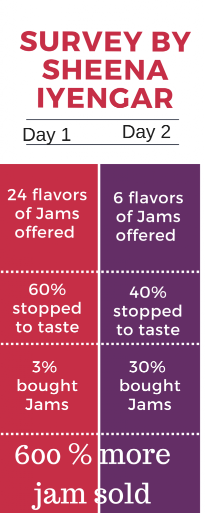
This shows, multiple options changed customer buying behavior which likely creates inability to make a purchase. Hence, an ideal choice of options should be made available to them.
Simple is Always Easy
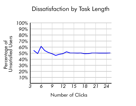
Never create a battlefield for your customer to buy a product. Always serving information which a customer requires is what leads to conversion. Avoid confusion with multiple clicks that gives different results, or often confusing tabs or categories name which puts them somewhere which they are not looking for. Study also shows, poor conversion is not because of several clicks, but with unexpected outcomes.
Simple Explanation for Everything
Surely, when your customer visits your website, they want to be aware what they are buying. For this, every product should speak in a layman language to the customer. The explanation should be easily understandable to the customer, no matter if it is available in the rest of your webpages.
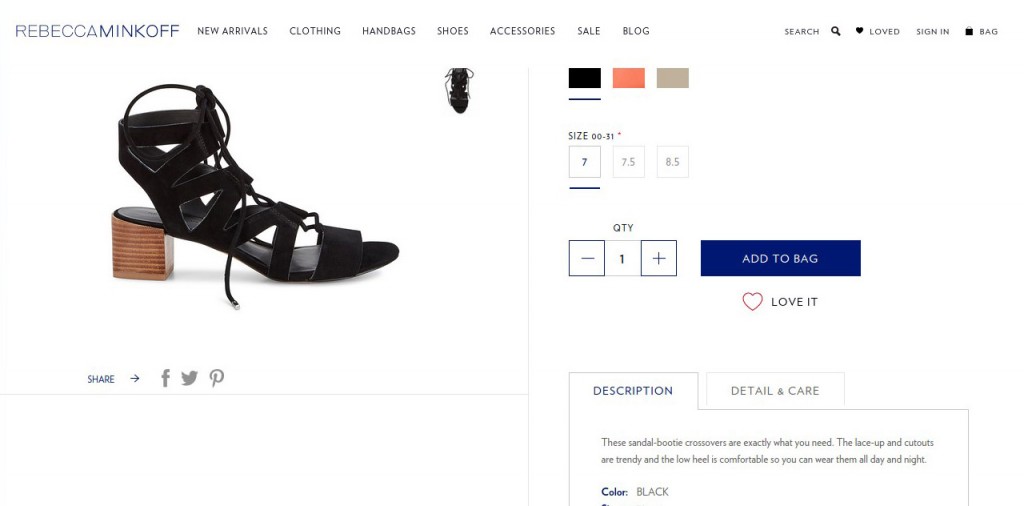
Rebecca Minkoff explains every important details about their product. The customer can also find the complete detail and how to take care of their shoe.
Quality Product Images
The very first thing that would make a product sale is, its images. Well, unless customer gains confidence in the product, they won’t proceed with the purchase. Although, product with the proper images and explanatory description have high possibility of convincing customers to purchase them.
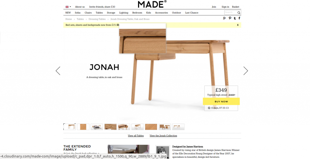
Here, Made has given several images of their product with the facility to zoom each images to have a more detailed look of the product.
These are few website elements that should be taken care of. If you have used any of them, then do let us know.
If you need any professional consultation while designing your eCommerce website, then feel free to contact our eCommerce Website Designers.








Thank you Jayesh for sharing these some of the helpful tips about the best practices of website design. I will definitely take care of these tips when I’ll be planning about upgrading my website, in near future. Thanks again!
As a shop owner I was always confused how to make my website attractive for my customers. And I can see that you have shared some great tips and tricks to make the website make user friendly rather than owner friendly. Thanks for these tips!