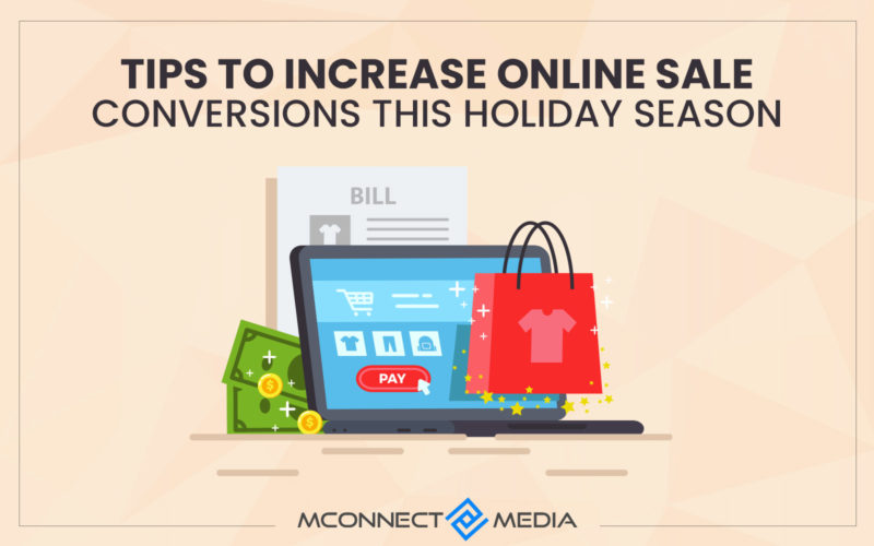
It is no longer a secret that the checkout page is the bread and butter of eCommerce websites, especially when it comes to monetizing items or services. It is no surprise that this is where the majority of the traffic originates. After all, it is the checkout page where you generate leads. Landing pages are significant since they are where consumers take action to proceed and complete a purchase.
As a result, these sites are the marketer’s first pick for A/B testing optimization. However, the CRO techniques for the two pages differ. It is critical that you give your visitors with a website where they can discover relevant and optimized material, as well as a solution to their concerns.
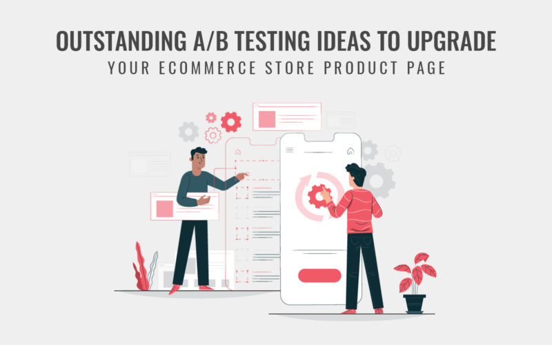
Also Read: 7 Outstanding A/B Testing Ideas to Upgrade Your Product Page
When your consumers believe you are the best option for them, you have created a conversion opportunity. So, before we go into the differences between optimizing a checkout page and a landing page, let us first define a conversion funnel and how it works.
What is Conversion Funnel?
A conversion funnel is simply the several steps of a buyer’s journey that lead up to a final purchase. The conversion funnel sometimes split into several variants, the most common of which are the upper, middle, and lower funnels.
These words allude to a potential customer’s level of knowledge about a product and how near they are to acquiring it. Here, we will go through each funnel and explain why it is important for your conversions.
1. Brand awareness – Top of the Funnel
When clients are seeking for solutions to their issues and discover that brand is the best option for them, they will become aware of your brand. This is your chance to demonstrate to them that you are the best option for them.
To do this, you may present fantastic CTA to your product features as well as relevant material to compel people to purchase. If you do it well, your visitors or users will be drawn to you and want to learn more about you and your companies.
Also Read: Social Media and Sales: 5 Ways to Improve your Brand’s Visibility
2. Choice – Middle of the Funnel
Okay, now that you have informed your audience on what your brand stands for, it is time to convince them to select you over others. This is something you must do carefully if you want to persuade your visitors to become clients.
You may persuade your visitors to become customers by posting blogs, videos, and articles that educate them about your business and products. This is where you demonstrate to your consumers how your items can address their issues.
3. Leads – Bottom of the Funnel
And last, conversion. It is time to start generating leads. This is the page where your prospective consumers fill out their information and click purchase now.
Also Read: Top 3 Conversational Commerce Strategy to Boost Conversions
Why is an Optimization of checkout so important & what should be tested?
The checkout page is a vital element of a customer’s purchasing process, and website should feature a faultless checkout option. Your testing can help you understand what can be modified to increase conversions. But testing the checkout page is not the same as testing the website.
Your checkout page contains several forms, each of which your clients will prefer. Some people prefer a single template over a sophisticated and multiple template, while others prefer fewer fields to fill out with an email.
You must ensure that checkout page is visible to customers by include product information, price tags, and an appealing design. Once you have completed the design, go through the checkout page to evaluate what clients prefer and how you can enhance.
Make the checkout page as basic as possible to save clients time filling out a plethora of information and facts. Hire a Magento Developer to create the best checkout page for your eCommerce website.
Consider the following variables while improving your checkout page:
- The first step in optimizing your website is to create a one-page checkout. The rationale for this is that if you have a quick checkout, your clients are more likely to make a purchase.
- The second consideration is design. If your website has different themes and designs, you must create a simple checkout page.
- The third and most significant aspect of improving the checkout page is experimenting with various payment options. Try to provide numerous payment ways so that your clients may complete their checkout from any website.
Cart abandonment rate, income per visitor, engagement rate, and preferred payment method are all indicators to monitor as part of your optimization. This is how to improve your checkout page and ensure a smooth buying experience.
With Customer Specific Product & Price Extension, each customer and customer group should be allocated a distinct product and price. Check that catalog permissions and visibility are appropriately established.
By optimizing various aspects on page, you can ensure that company achieves maximum conversion rates from clients who arrive at certain landing pages.
You should test the headline, CTA, picture, and product description when optimizing landing pages. It is also critical to monitor your bounce rate, visitors, and goal completion. Depending on the results of the testing, you have various tools and modifications at disposal to optimize landing page.
It is critical that you create a feeling of urgency by telling the customer how long product will be in stock. This is finest technique to capture customer’s attention. Since they believe that if they do not buy within a certain time frame, they will miss out on the opportunity.
Another thing you should do is avoid charging extra fees or costs when selling things to your consumers. Many shops include hidden prices like as taxes and shipping fees that might effect your customer’s purchase.
Abandoned cart emails should delivered to consumers within 24 hours to urge them to return and purchase again. You may also use live chat to provide active help, which will increase your clients’ confidence.
What’s actual difference between optimizing landing page and checkout page?
The checkout page optimization process is used to increase website traffic. This traffic constitutes people who respond to certain pop-ups or buttons. Optimization of landing pages takes place when the elements of a website are improved to enhance conversion. As a part of enhancing overall conversion rates, landing page optimization is nothing more than a subset of checkout page optimization.
Conclusion
Checkout page optimization is an essential component of any website for increasing client base and income. Based on the foregoing, whether it is the checkout page or the landing page, you must continue to research and adopt new methods to make the consumer experience as easy as possible.
Need help in optimizing your checkout page and landing page? M-Connect Media can help. We have eCommerce consultants who know how to make your customer experience smooth and easy as pie. Please contact us for more information.


